New in Operator! Charts, dashboards & exporting chart data

Nachrichten
16 November 2023

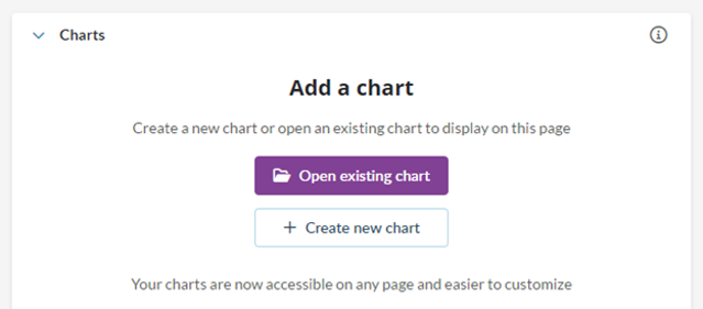
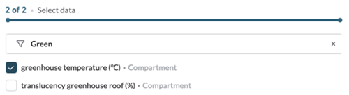
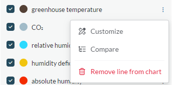
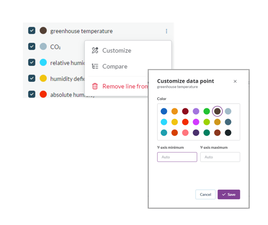
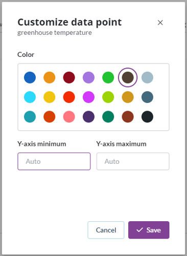
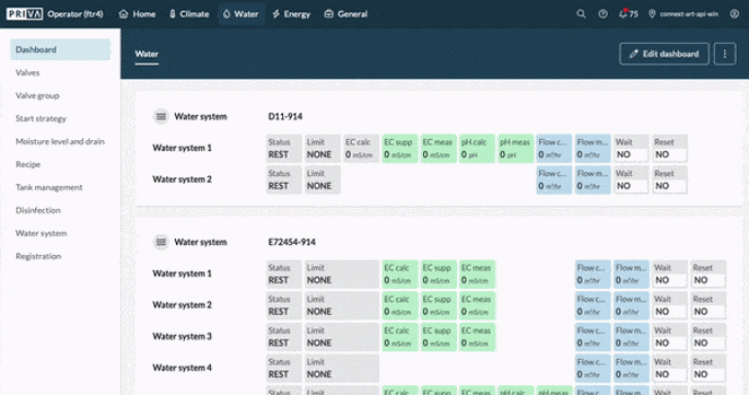
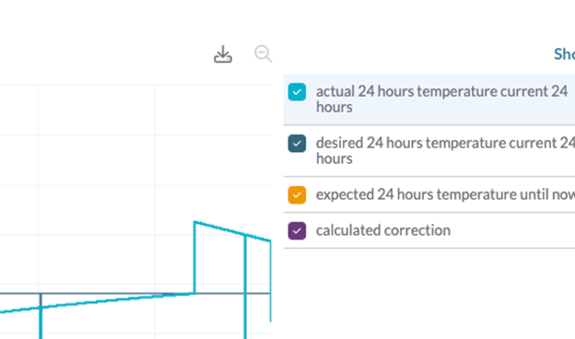
Optimize your analyses and save time with the new charts in Operator. In addition, take advantage of the new features for customizing your dashboard and exporting data. Read on to discover the benefits.

Book a demo

New charts

This is why you should try out the new charts in Operator:

  • Create a new chart in no time and easily add data points.
  • Easily use the charts you've created in multiple places in Operator.
  • Navigate through multiple charts with convenient tabs and quickly analyze multiple groups of data points.
  • Customize colors and axis settings for a graphical display that perfectly matches your style.

How does it work?

Just go to any page in Operator where you would usually find a chart, like a compartment on the Ventilation page, and select ‘Create new chart’.


Pick a name for your chart. A tip: keep it generic (like ‘Ventilation chart’), because this chart will be used on multiple locations.

Using the search bar, find some data points you’d like to see in your chart.


Select ‘Create chart’ to confirm your selection. Don’t worry about being complete at this point because you can add data points later by going to the ‘Setup’ tab.

After confirming, you have just created your first chart! Operator will automatically open the same chart on all similar pages. Operator will also use the correct compartment depending on where the chart is used.


Adding data points
If, for example, greenhouse temperature is something you’d like to see in your chart, you select it when creating your chart:


After that, the greenhouse temperature of the compartment page that you are on will show up in your chart:

Operator Chart Legend EN

Another advantage of the new charts is the improved ability to customize data points. You can easily change the line color and Y-axis scale in the setup of the chart. This allows you to create a chart that looks exactly the way you want it to look!


Customize data points in Operator for Connext and add data points


How to customize data points in Priva Operator for Connext and Compact CC


Another major addition to the charts is the ability to open multiple charts in a row using tabs, allowing you to quickly analyse multiple groups of data points. So instead of putting 20 lines in a chart and toggling groups of lines on and off, you create these separate groups in separate tabs.

Operator Chart Customized Chart (1)

Editing dashboards

Editing dashboards just got easier! When selecting ‘Edit dashboard’ from one of your existing dashboards, you can do your editing on the widgets and cells instead of in the top bar. This allows for easy editing of colors, width, icons and labels.


On top of that, we’ve added the ability to add hyperlinks to your dashboard. This way, you can easily navigate to specific locations within Operator directly from your dashboard. You can add a hyperlink to any label text by clicking on it in ‘Edit’ mode.

Exporting chart data

Do you analyze your climate data in Excel? Or do you want to be able to analyze climate data over longer periods of time? In Connext and Compass Operator, you are now able to export chart data and download it as a CSV file that easily converts to an Excel workbook for further analysis. You can find the export button from now on in the top right corner of any chart!